
Fourteen Magazine
+ Brand Identity
+ Website Design
+ Editorial Design
Fourteen Magazine is an online thematic bi-annual magazine that platforms anti-caste writing and multimedia work.
The logo for Fourteen Magazine is type-heavy, integrating the slash (/) symbol, commonly used in dates, to emphasize the name's roots in Ambedkar Jayanti and making it a recurring motif across the brand.

Website Design
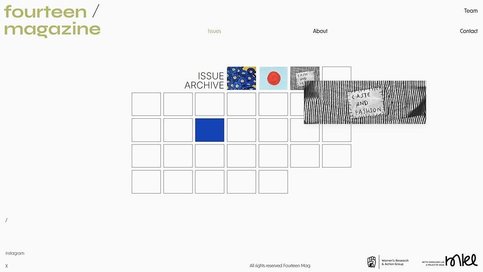
The visual direction for Fourteen Magazine website draws from the April 1891 calendar layout, with the calendar serving as a foundation. The Issue cover substitutes the boxes in the calendar with each published Issue and the 14th box, marking Ambedkar Jayanti, is highlighted as a functional button.
The pages on the website use curated images of Dr. Ambedkar’s iconic hand gestures, reinforcing his work on anti-caste movement.
_edited.jpg)


ISSUE 03 : CASTE AND FASHION
For the third Issue, the cover is approached through the object that tells us about who "makes" the product, while at the same time invisibilizing the people who actually make it - the label. The cover for the issue uses scans of a label that reads "Caste and Fashion" and expands itself into the central visual element for the Issue.
The reverse side of the label reveals accidental knots, textures, and traces of the process of making the label. The label expands through its materiality, becoming a recurring visual motif throughout the issue, appearing in thumbnails for individual articles and creating a cohesive editorial identity.
_edited.jpg)
_edited.jpg)

ISSUE 02 : CAST AND CLIMATE JUSTICE
The cover art for Issue 02 draws inspiration from the visual language of collage and pixel art, stitching together fragmented narratives into a visual landscape. The composition is built through a grid of squares, each containing an element drawn from the environments and themes explored within the issue’s articles.
Individually, these fragments act as visual cues to their specific articles; collectively, they form a landscape that brings together the Issue’s multiple perspectives into a single frame.
Created on paper, the cover art lets texture and tactile qualities become an integral part of the final visual language.

The process
Scans from the sketchbook : Logo exploration for Fourteen Magazine


Meta Knowledge Lab - Logo Design
Fourteen Magazine is produced by Metta Knowledge Lab, a project of Women’s Research and Action Group (WRAG). The logo of MKL is a type-heavy icon derived from the Malayalam script.
